I know that you’re thinking. It isn’t even spring yet.
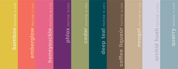
But Pantone has come out with their fall colors and they are just too delicious not to share. What are your thoughts on this palette?

They are calling this collection “Sensible and Spirited.”
Influences: the great masters, sepia tones of old Hollywood, Chinese opera, cityscapes and countryside. Menswear with feminine twists, warm prints with cool metals– creating an intriguing balance between colors.
Bamboo, a surprising fall hue, brings a warm, exotic flavor to the season. Like a filtered sunset on the waning days of fall, Bamboo is a standout yellow with a subtle green undertone.
Radiant Emberglow, a traditional autumnal tone, emanates the warmth of a glowing fire – the perfect panacea to the crisp air of fall.
Offering a sense of continuity from spring, dynamic Honeysuckle adds a bold punctuation point.
Phlox is a magical, deep purple with a hint of mystery.
Evoking the freshness of a cool mist in a dark forest, Cedar is a versatile, mid-tone neutral green.
And the “neutrals”:
Rich, decadent Coffee Liqueúr brings a sense of elegance to fall, and is a savory alternative to basic black. A deliciously warm camel tan, Nougat is tastefully embellished by Phlox, Emberglow or Honeysuckle. Orchid Hush, a unique tone of gray with complex orchid undertones, blends well with any other color in the palette. Quarry, a reliable medium gray, remains, as always, a practical, dependable staple.
Image and Text via Pantone

oh yum! I prefer the right hand side of the palette, from cedar to quarry, but they are lovely.
I’m seeing emberglow everywhere! I have 2 new shirts that color and it’s all over the stores. And lol, I’m wearing the deep teal today!
Not sure what pantone is?
But I like bamboo and dark teal the best!
I love the muted jewel tones, very easy to wear and use in home decor. Thanks for sharing!
Victoria
Very pretty colors! Can’t wait!
It is gorgeous…I am trying to figure out what to paint honeysuckle.
Loving the names of these colors!